
SCREAMING POSTERS OF THE SILENT TWENTIES
 |
| Author Unknown, "October," 1928 |
The new rulers of Russia found themselves at the head of a sprawling state that had previously controlled its enormous, largely illiterate population with rituals, symbols and customs that were tied to the old regime. New ways of communicating the new order to the peasant masses had to be quickly devised for both the cities and the countryside.
 |
| Aleksandr Naumov, "Bella Donna," 1927 |
Perhaps the most impressive collection of Soviet-era posters in Japan is that of fashion designer Ruki Matsumoto, now on show at The Museum of Modern Art Hayama in the exhibition, “Seeking for Utopia: Russian Avant-garde and Modernism Seen in Posters.” Matsumoto, who died last year, was the founder of the BA-TSU apparel brand and an important figure in the Japanese fashion world.
It may seem ironic that an exhibition of Communist posters is being held at a venue that happens to be located near the site of the Imperial family’s seaside villa. An even more ironic location was used for an exhibition featuring the same collection in 2001, when the Tokyo Metropolitan Teien Art Museum, a former palace for an Imperial prince, was used.
This apparent affinity between Soviet posters and art venues with royal associations need not be wondered at too much, however, because the posters are not the drab pictures of tractors and sullen-faced workers that some might imagine, but artworks that maintain their own panache and aesthetic glamour.
 |
| Nikolai Prusakov and Grigory Borisov, "A Journey to Mars," 1926 |
This idea of “screaming” transposed into visual terms is evident in a number of characteristics. These include images that actually suggest sudden blasts of noise, such as the woman with a megaphone in Vera Gitsevich’s For the Socialist Forge of Health (1932), a poster promoting outdoor exercise, or the sailor placed between the guns of the battleship in Anton Lavinsky’s poster for Sergei Eisenstein’s classic movie Battleship Potemkin (1926).
Other ways to make the posters “scream” included loud colors. Nikolai Prusakov’s poster for the 1929 German movie Man of Fire presents a disembodied hand in a sea of vibrant red, a color that was possibly overused in Soviet Russia.
 |
| Aleksandr Rodchenko, "Kino-Glaz (Film Eye)" 1924 |
The diagonal composition is often key. In their poster for the movie October: Ten Days That Shook the World (1927) Yakov Ruklevsky and the Stenberg brothers dramatically split the picture plane in two. They then and used different scales in each section to magnify the figure of a revolutionary sailor in the top right section, whose arm reaches across the diagonal.
Just as Ruklevsky and the Stenbergs created tension in this work by contrasting different scales, other works created energy by juxtaposing photomontage with blocks or color or other design elements, as well as the innovative use of type.
All these various techniques create a sense of “visual noise” that reminds us that the 1920s was actually the Silent Era, a time when the sounds of the fast-approaching modern world had to be created in the heads of the masses by the tricks of poster artists as well as movie makers.
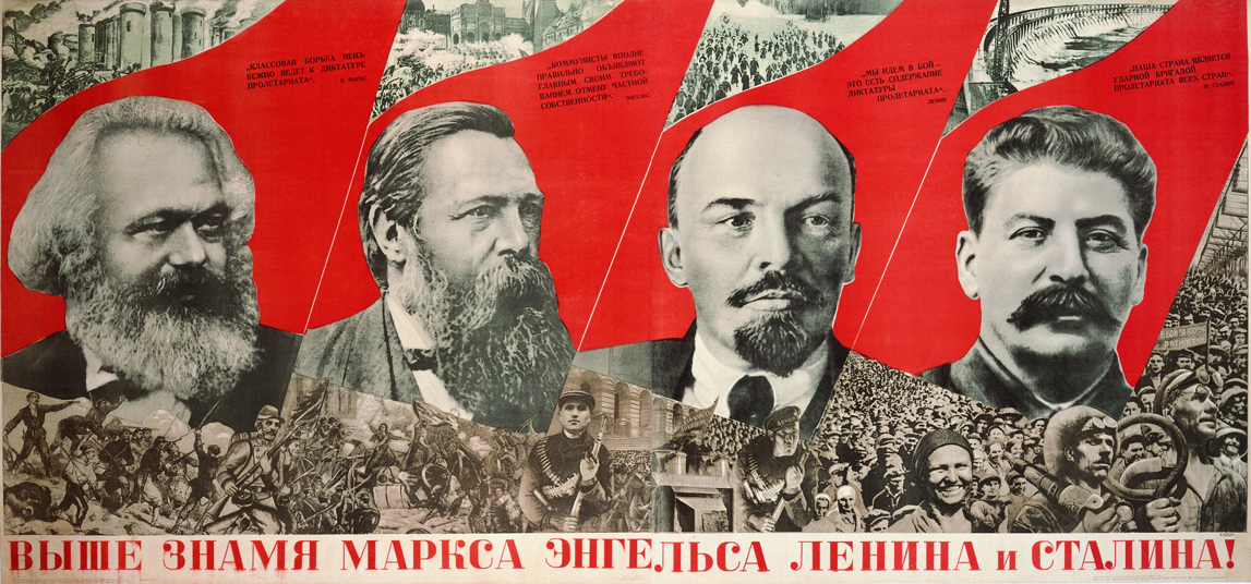 |
| Gustav Klutsis, "Raise Higher the Banner of Marx, Engels, Lenin, and Starin" 1933 |
C.B.Liddell
Japan Times
11th December, 2013


Post A Comment
No comments :